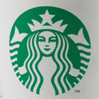
Starbucks is dropping its name and the word “coffee” from its logo, leaving the curvy siren as the lone symbol of the Seattle-based company that started the gourmet joe revolution 40 years ago.
It’s a natural evolution, according to marketing experts at the Olin Business School at Washington University in St. Louis.
 “Starbucks is back on track after a two-year sales slide and a logo redesign seems timely,” says Martin K. Sneider, adjunct professor of marketing.
“Not only does it signal that the company has pressed the reset button but it also underscores the strength of the “siren” symbol which identifies Starbucks to its millions of customers.”
The new Starbucks logo, sans the familiar circle with the words Starbucks Coffee, will start appearing on cups and products soon. Sneider says dropping the circle and words doesn’t limit the company to coffee.
“The elimination of the script which surrounds the current logo will free the company to extend the brand into product lines other than coffee.”
John Norton, senior lecturer of marketing at Olin says, “There’s a trend toward the use of the abstract — no names, just symbols — among brands. A well-known brand can pull it off.”
He points to the examples of Shell Oil, General Electric and Mercedes Benz.
“Lots of companies go for the abstract, without words, at some point,” Norton says. “Sometimes, just a color will do the job. Look at that remarkably unappetizing pink that Dunkin’ Donuts uses. Nobody else uses it, and it’s instantly recognizable.
Risk of logo changes
Carol Johanek, adjunct professor of marketing, says logos must communicate the brand’s message and be understood quickly.
“A ‘disconnect’ between a logo and the customer’s perception typically results in doubt and confusion on the part of the consumer, with a hesitancy to purchase,” Johanek says. “I can only hope this message was adequately tested with the new logo among its customer base to avoid the recent GAP debacle.”
“Whenever a brand changes its logo — and most do over time — there’s argument between those who want a different, usually more contemporary look and those who subscribe to the dictum, ‘if it ain’t broke, don’t fix it,’ ” Norton says.
“Most of the time, the decisions to change a logo aren’t disastrous; neither do they herald a new era, or anything else, for the firm. They are just part of the steady progression of the brand, part of an effort to stay current and relevant to their customers,” he says.