Graphic design can be a matter of life and death. Literally.
According to the Journal of the American Medical Association, more than 40 percent of Americans aged 65 and over use five or more different medications each week, making unintended drug interactions a major contributor to an estimated annual 180,000 fatal or life-threatening adverse drug reactions.
Yet drug labeling is, informationally speaking, a kind of typographical Wild West, says Ken Botnick, professor of visual communications in the School of Art at Washington University in St. Louis.
“Drug companies are required to divulge certain types of information but there are no requirements in terms of how accessible that information is made,” Botnick explains. “Typically, decisions about the way information is organized — the hierarchy of presentation, the size and clarity of type — are simply afterthoughts.”
Medical information design is just one of the issues to be explored as part of Visual Design for an Aging Population, a national symposium Botnick is organizing in March 2004. The conference will examine the often-underappreciated impact of aging on visual perception, and the related implications for designers, advertisers, print and Web-based publishers and others catering to older populations.
Participants include noted graphic and information designers as well as architects, gerontologists and psychologists from around the country.
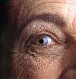
By the time one reaches age 60, subtle shrinking of the pupil reduces the amount of light reaching photoreceptors by as much as three-fourths. This causes colors — particularly “cool” colors, such as blues, greens and purples — to appear dimmer and less distinct. At the same time, hardening of the lens hampers one’s ability to focus on fine details, such as small print, and to distinguish slight gradations of tone (i.e., light-on-light, dark-on-dark).
Moreover, the eye’s ability to adjust to differing levels of light and brightness dramatically decreases, making glare, from slickly printed pages or plastic packaging, difficult to see past. Such problems are only compounded by age-related diseases such as glaucoma and cataracts.
Such issues have a special urgency today, as the U.S. population grows increasingly older. According to the U.S. Census Bureau, the number of people aged 65 and over increased 11-fold during the last century, from about 3 million in 1900 to more than 33 million in 1994. Over the next 40 years, that number will climb to more than 80 million. Moreover, by 2020, the number of Americans ages 85 and over will triple, with one in nine Baby Boomers expected to live to at least 90. Of all humans who ever lived to 65, half are living right now.
‘Visually sophisticated’
Still, “99 out of a 100 Web sites are designed by young people with young eyes,” Botnick notes. “Even designers who work with seniors specifically in mind often make incorrect assumptions about what their audience can or wants to see.”
For example, designers targeting older populations typically choose “old-fashioned” looking serif-style typeface. However, it turns out that older eyes have difficulty picking up fine detail on ornate typefaces, particularly in Web applications. Seniors actually prefer cleaner, more modern-looking sans-serif designs, which offer less visual clutter.
“Large print, high contrast, low glare — these are very simple points, but they’re seldom part of the way we actually practice graphic design,” Botnick says. “In fact, a lot of conventional design wisdom, in terms of color theory and so forth, actually flies in the face of usability for older people.
“On the surface, that might seem to imply that one would have to compromise aesthetically to design for older users,” Botnick concludes. “But that’s the challenge. Baby Boomers have invested a lot of money in homes, cars, clothes and other beautifully designed things. They are visually sophisticated in ways that demands a certain level of attention.
“The physical changes they’re going through will demand yet another level of attention.”
Conference schedule
Visual Design for an Aging Population takes place Friday, March 19, 2004, at the Washington University in St. Louis School of Medicine’s Eric P. Newman Education Center. The conference is sponsored by the School of Art and the Center for Aging. Registration is $100; student discounts are available. For more information, call (314) 935-6500 or visit http://designandaging.org.
Speakers include graphic artists, architects and aging specialists from across the county. Joseph F. Coughlin, director of MIT’s new AgeLab, will present the keynote address. For a complete list of participants, visit http://designandaging.org/speakers/