A woman goes to the doctor for a mammogram. The result comes back positive. “This doesn’t necessarily mean you have cancer, false positives are common,” her doctor might say. Maybe the patient is also given a pamphlet with some statistics about mortality and survival rates.
But the test did come back “positive,” the patient thinks, so maybe the doctor is just trying to make her feel better. Maybe the patient doesn’t understand the difference between mortality and survival rates and hasn’t thought about statistics since a class in high school.
To help patients better understand their health data and the risks and benefits of treatment options, the National Science Foundation (NSF) has awarded a $174,254 grant to Alvitta Ottley, assistant professor of computer science and engineering at the School of Engineering & Applied Science, and of psychological and brain sciences in Arts & Sciences at Washington University in St. Louis.

“Lots of people are receiving test results and they don’t understand them,” Ottley said. “They have to understand procedures and their risks, and then there are false positives and false negatives. My job is to take this somewhat complex statistical information and present it in ways people can understand.”
Ottley has worked on general visualization problems that ask how our individual psychology affects the way we receive information and make decisions. She also has built tools for facilitating communication between doctors and patients.
In this current project, however, the tools she is building are not for experts, they’re for patients with no expertise in medicine or statistics.
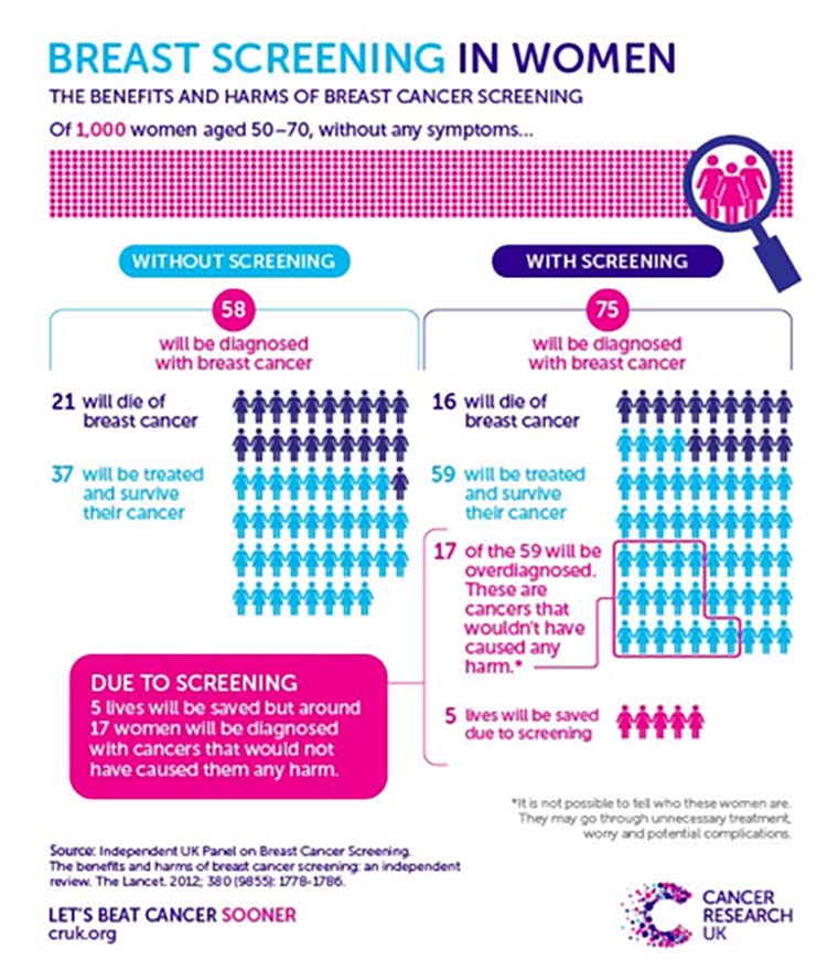
To be sure, there already exist plenty of formats for visually describing these things to laypeople. The most popular of these formats, according to Ottley, is the icon array. A single icon array can be used to indicate, for instance, rates of breast cancer, including people who were accurately tested as well as those who received false negative results.
Such a graphic might use symbols representing people. In the example pictured, there are 10 rows by seven columns, with an additional five symbols set somewhat apart from the main grid.
All 75 symbols represent people diagnosed with breast cancer.
Purple symbols represent those who died from the disease. Blue symbols represent those who were treated and survived. Of those 50 symbols, 17 are outlined in pink. They represent overdiagnosis — people whose cancers would not have been harmful if left untreated.
The five pink symbols that are set apart from the main grid represent people who would have died if not for the screening.
“These can be hard to understand,” Ottley said of icon arrays. “It is especially confusing to someone with no statistical training nor numerical skills. We’re trying to figure out the best way to represent this.”
Her lab is not just looking at how to render easy-to-understand images, but also whether or not images are truly the best way to represent data.
Even if a picture is worth a thousand words, Ottley wondered, would it make things even clearer if text were added to visualizations?
Her past work indicated that it will not. “What we’ve found is that if I give you text alone, you’re not really good at understanding it. If I give you data visualization alone, you’re just a little bit better. But if I give you both, it’s completely confusing.” Ottley said. “You have to read the text and understand that, and then try to figure out the visualization, and then determine how the two relate.”
Complicating the issue, Ottley also found that measures of “spatial ability” can determine a person’s success in reasoning with medical statistics.
To get to the bottom of the question, members of Ottley’s lab will be looking at approaches that have been successful in decreasing cognitive load — the amount of information a person needs access to in their working memory — and using those approaches to design easier-to-understand visualizations.
Using eye tracking, the group will determine in what order people are absorbing information and how well they understand it.
“We will look at what order leads to successful decision making,” Ottley said. “Perhaps everyone who makes the right decision — assuming there is a right decision — consumes the information in a specific order. If we can identify successful strategies and pathways, we can redesign visual representation so that people are more likely to use these pathways.”
The lab will also look at decision biases: why some people may be prone to taking action because — or in spite of — the information they’ve received.
Ottley understands that it’s more than statistics that lead a patient to choose or forgo medical treatment. There is a large emotional component, as well. “If a doctor says, ‘you have cancer,’ some people might just say, ‘OK, let’s do this,’ and opt for treatment without a second thought,” she said.
Then, there are some people who would like to know as much as they can. “Why not give these people the options and the tools to really, truly understand the data?” Ottley asked. The decisions can be difficult, and to some, providing all of this information might seem like placing the burden on an already-anxious patient.
Ottley sees it differently, however, and hopes to make it easier for others to see, not just the data, but the potential benefits of improved visualization. Instead of burdening patients, she said, “Improved data visualization could empower them.”