“I use the same process for digital printing that I’d use for intaglio or lithography,” said Carmon Colangelo. “Print it, change it, and then print it again. Each iteration gives you something different to respond to.”
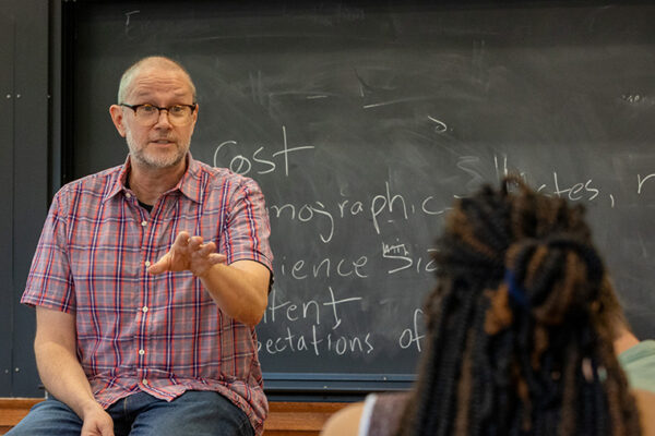
Colangelo, a celebrated printmaker as well as the Ralph J. Nagel Dean of the Sam Fox School of Design & Visual Arts at Washington University in St. Louis, is discussing a new body of work commissioned by the 21c Museum Hotels.
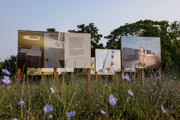
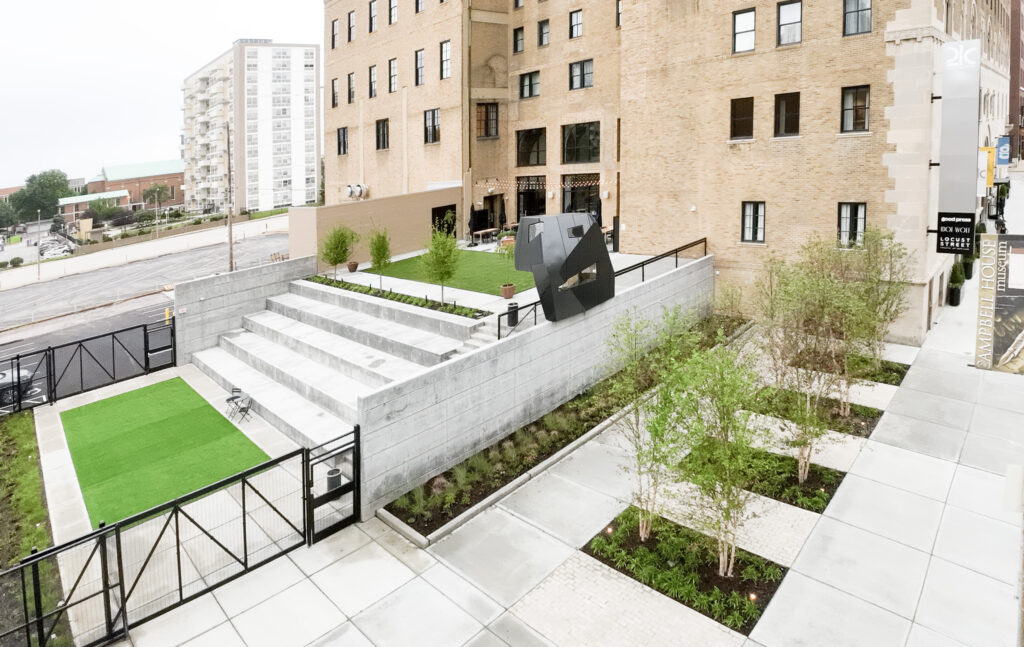
Known for its outstanding collection of contemporary art, 21c recently debuted a new facility — its eighth — in downtown St. Louis. The 10-story Renaissance Revival building, a former YMCA, now highlights more than 70 works by a wide range of internationally celebrated artists, including three digital prints-on-canvas from Colangelo’s “Infinite Abstraction” series (2018). Other featured artists include Sam Fox School associate professor Chandler Ahrens and Sam Fox School alumni Quinn Antonio Briceño (MFA ’22), Yvonne Osei (MFA ’16) and Ebony Patterson (MFA ’06).
But over the last two years, Colangelo, who also serves as the Sam Fox School’s E. Desmond Lee Professor for Collaboration in the Arts, has played an additional role. Working with 21c Museum Hotels chief curator Alice Gray Stites, and with St. Louis-based printing and framing vendors, Colangelo created fresh iterations of two originals, “Cartesian Shout” and “Cartesian Twist,” for the hotel’s 173 guest rooms.
In this Q&A, Colangelo discusses the project, his artistic process and the navigation of new technologies.
How did this collaboration come about?
Alice saw my “Infinite Abstraction” exhibition at Bruno David Gallery and selected three pieces for the 21c permanent collection. She also was interested in having a St. Louis-based artist create work for the hotel rooms. I’d stayed at the original hotel, in Louisville, and knew it was something really special.
You often combine traditional printmaking with digital technology. How did you arrive at that process?
It’s been an evolution. But for me, there’s always been a dialogue between technology and studio practice. I started teaching in 1984 and got my first Mac Plus in 1985. I’m not deep into computers, but the Mac did make some things intuitive. You just have to be experimental and push the parameters so that the visual language isn’t dictated by the software.
The aesthetic gravity of new technologies …
Yeah. You have to work the edges and discover ways to make things feel different. So I’m really interested in notions of hybridity and combining traditions. And in printmaking, there are also deep-rooted elements of translation and improvisation. Every decision begets something else.

How would you describe the “Infinite Abstraction” series?
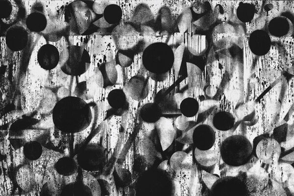
It sits somewhere between geometric and gestural abstraction. Each work is based on a series of moves — going back-and-forth between printing and the digital screen — that I call my ‘faux algorithm.’ It’s not really a mathematical equation. It’s more of a playful notion about how the digital realm is built on numerical systems. Math explains the universe, science explains the universe. Maybe art can explain the universe, too.
Prints are typically editioned on paper. “Infinite Abstraction” comprises unique works printed on canvas. Can you unpack that gesture?
The idea of “printing paintings” was about locating the spaces between what’s considered a painting and what’s considered a print. Oftentimes, things on canvas are considered paintings, even when — like Warhol’s silkscreens — they’re really printed. But I also thought turning these originals into multiples, for the hotel rooms, brought the series full circle.

In all, you made 173 prints for 21c St. Louis, in four variations: two sizes each of “Cartesian Shout” and “Cartesian Twist.” How long did you have to complete the work?
We had about a year to prepare, and then another year in which to make the prints. The originals had been printed in layers in my studio — they weren’t just a single file — so I had to recreate that process. We also had to decide whether I’d print them all or whether we might use a local vendor.
I tested both and decided to go with NovaColor in downtown St. Louis. They’ve done work for other artists, including Tim Portlock, so I knew the quality was really good. Over the course of several visits, we made prototypes on their equipment, which is different from what’s in my studio, using different canvases and color layers.
How distinct are the editioned versions from the originals?
It’s an interesting line. They’re based on the same two works, but if you could put them side by side with the originals, you’d notice differences. At least, I can see the differences! Partly it’s because the process was different. We changed image size, printer, the type of ink, the canvas … I was pretty picky about the color and surface. I wanted it as crisp and nuanced as possible, but it also had to be durable.
I also made slight adjustments to the color, shifting some blues and greens and keying up some red highlights. In all, we probably spent three months on the printing alone. And of course, getting everything framed was another big job.
These are multiples, but there was a lot of attention to detail. There’s personal care in every work.